Administration Tool
Charting
KioWare Server has the ability to graphically show many different kinds of statistics through the means of charts. Most reports have a corresponding chart. Kiosk heartbeat reports have charts that detail most aspects of the heartbeat data.
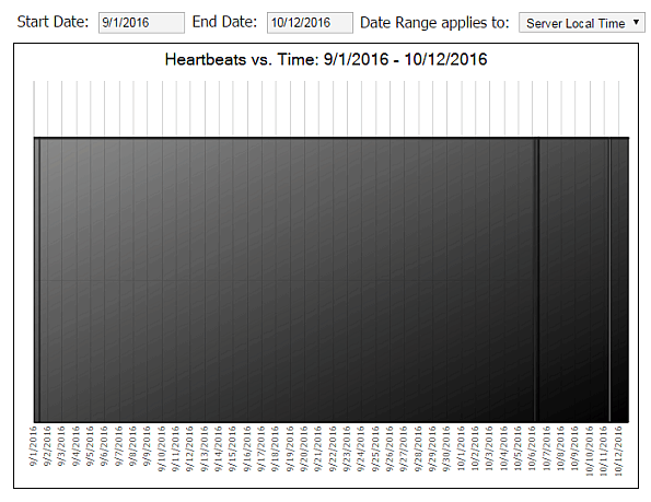
Heartbeat Timeline
Graphically shows heartbeats that occured over a specified period of time.
Heartbeat Detail Chart
Graphically shows heatbeat detail data including:
- Page Stats
- Hard Drive Space
- Handle Count
- Memory Load
- Page Errors
- Pages Printed
- Pages Viewed
- Restricted Pages
- Script Errors
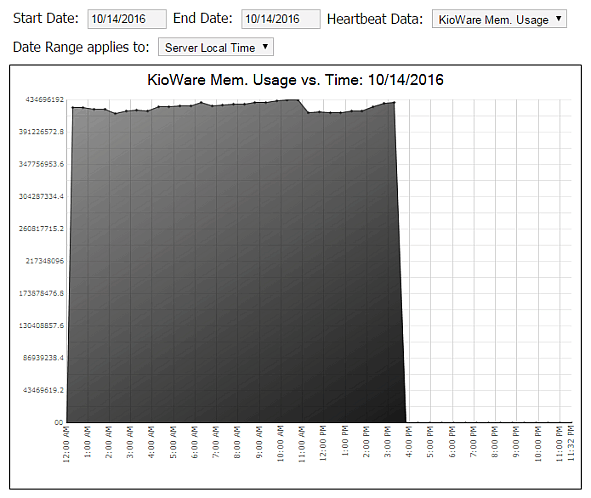
The image above shows KioWare memory usage for a healthy kiosk. If this chart should show sawtooth-style spikes, it may indicate an issue with memory leakage or some other type of problem. In this case, the chart will allow you to monitor the kiosk, helping you to troubleshoot any issues that may be occurring.
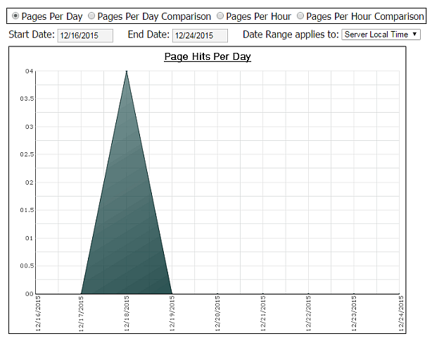
Page Usage Stats Chart
Graphically shows page hits with these options:
- Page Hits per Day
- Page Hits per Day comparing with another set of days
- Page Hits per Hour
- Page Hits per Hour comparing with another day
Session Usage Stats Chart
Just like Page Usage Stats Chart (see above) only it pertains to user sessions.
Page Printing Stats Chart
Graphically shows pages that have been printed with these options:
- Prints per Day
- Prints per Day comparing with another set of days
- Prints per Hour
- Prints per Hour comparing with another day
Kiosk Usage Charts
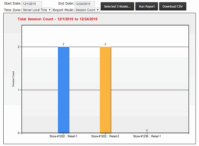
Graphically shows usage for a range of kiosks with these options:
- Time Zone (server local time or kiosk local time)
- Report Mode (session count, page count, or session time)
To set the range of kiosks, click the Selected Kiosks button.
Click the Download CSV button to create a comma separated values file for saving the report data.
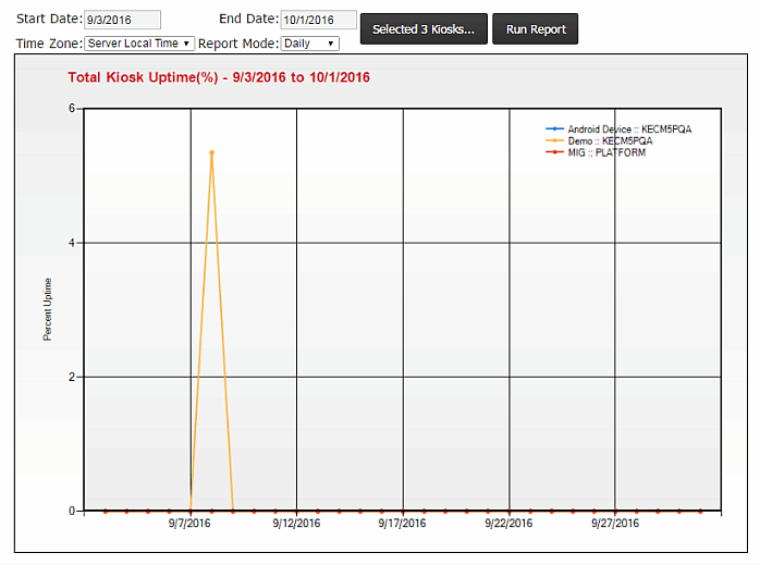
Kiosk Uptime Chart
Graphically compares active hours for a range of kiosks with these options:
- Start Date (date to begin)
- End Date (date to end)
- Time Zone (server local time or kiosk local time)
- Report Mode (daily, weekly, or monthly)
To set the range of kiosks, click the Selected Kiosks button.
