Configuration Tool
User Interface Tab
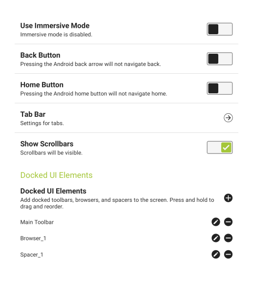
- Use Immersive Mode - (Available only with Android v. 4.4 and higher) If enabled, KioWare for Android will hide the system bar until the bottom of the screen is touched.
- Back Button - If enabled, the tablet's “Back” button can be used to move backward in KioWare for Android.
- Home Button - If enabled, the tablet's “Home” button can be used to return to the home page (“Start Page URL”) in KioWare for Android. Note: This feature will only work if the Android home app is set to “KioWare”.
- Tab Bar - Select this option to configure settings for user created tabs (see Tab Bar below).
- Show Scrollbars - If enabled, horizontal and vertical scrollbars will show when running KioWare for Android.
Docked UI Elements
- Add Docked Element (“plus” icon) - Select this button to add a new docked element. A popup window shows for choosing a browser, toolbar (blank or default containing five pre-set buttons), or spacer (for setting descriptions, see “Edit Docked Element” below; see also Setting Up Multiple Browser Windows, Setting Up Multiple Toolbars, and Setting Up Multiple Spacers below).
- Reorder Docked Element - Press an entry until it is highlighted and drag it up or down to reorder.
- Remove Docked Element (“minus” icon) - Select this icon to remove a docked browser window, spacer, or toolbar.
- Edit Docked Element (pencil icon) - Select this icon to change the settings for a docked browser window, spacer, or toolbar (see image below). This screen shows and looks the same for browser windows, toolbars, and spacers.
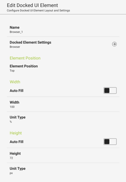
- Name - Enter a name for the docked element (applies to browser window, toolbar, or spacer).
- Docked Element Settings - Shows settings for the docked element (see Setting Up Multiple Browser Windows, Setting Up Multiple Toolbars, and Setting Up Multiple Spacers below).
- Element Position - Sets the docked position of the docked element (Top, Bottom, Left, or Right).
- Width - Use the settings below to set the width of the docked element.
- Auto Fill - If checked, instead of using the “Width” setting below, the docked element will attempt to fill the available width. For example, you could have a toolbar that is 200 px wide and create a docked browser set to “Auto Fill” to fill the rest of the space.
- Width - Sets the width of the docked element.
- Unit Type - Sets the unit for the width (pixels or percentage).
- Height - Use the settings below to set the height of the docked element.
- Auto Fill - If checked, instead of using the height setting, the docked browser window will attempt to fill the available height. For example, you could have a toolbar that is 200 px high and create a docked browser set to “Auto Fill” to fill the rest of the space.
- Height - Sets the height of the docked element.
- Unit Type - Sets the unit for the height (pixels or percentage).
Tab Bar
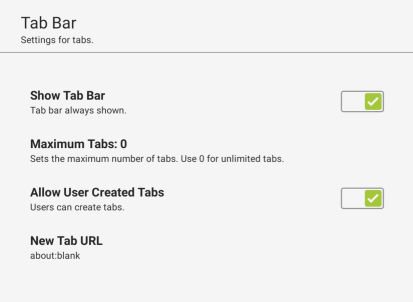
- Show Tab Bar - When checked, the tab bar will always display at the top of the KioWare for Android browser, even when only one tab is open. When unchecked, the tab bar can only show when “Popup Window Handling” is set to “New Tab” (see Browser Tab, Popup Window Handling). [This setting is included in the KioWare for Android security/configuration audit; see Audit Tab, Toolbar, Tab Bar.]
- Maximum Tabs - Sets the maximum number of tabs that can be open at one time (includes main browser window/original tab and tabs for additional start pages; see General Tab, Start Page Settings, Additional Start Pages). Set to 0 for unlimited tabs.
Note: If “Maximum Tabs” is set to a value that is lower than the number of start pages already set (see General Tab, Start Page Settings, Additional Start Pages), a popup window will indicate that the setting will need to be increased before continuing.
- Allow User Created Tabs - When checked, the new tab button (plus icon) displays on the tab bar for creating new tabs. [This setting is included in the KioWare for Android security/configuration audit; see Audit Tab, Toolbar, Tab Bar.]
- New Tab URL - Sets the default URL for all new tabs that are created.
Setting Up Multiple Browser Windows
This screen shows when you select the “Docked Element Settings” arrow button on the Edit Docked UI Element screen for browser windows (see Edit Docked UI Element screen under Docked UI Elements above).
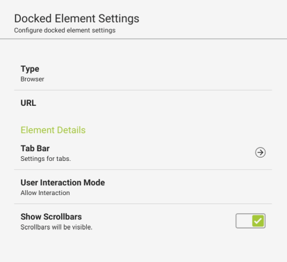
- Type - Sets the type of docked element (browser window, toolbar, or spacer). Be sure “Browser” is selected.
- URL - Enter a website address or file path that will show in the docked browser window.
Element Details
- Tab Bar - Select this option to show settings for user-created tabs (see Tab Bar above).
- User Interaction Mode - Sets if users can interact with the docked browser window.
- Allow Interaction - Allows users to interact with the docked browser window (enter text in textboxes, show dropdown menus, select buttons, etc.).
- Block Navigation - Prevents opening and viewing of any other web pages/files in this docked browser, or using the browser navigation buttons (Home, Back, and Forward).
- Block All User Interaction - Prevents navigation and all other user interaction.
- Show Scrollbars - Shows all types of scrollbars (in browser windows, from div tags, and in frames/iframes).
Setting Up Multiple Toolbars
This screen shows when you select the “Docked Element Settings” arrow button on the Edit Docked UI Element screen for toolbars (see Edit Docked UI Element screen under Docked UI Elements above). The screen looks the same for both default and blank toolbars, only the following five buttons are already set up for default toolbars: Busy Indicator, Back, Forward, Refresh, and Log Out.
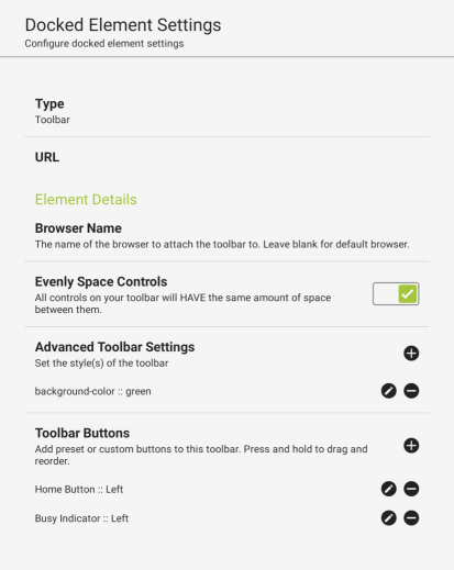
- Type - Sets the type of docked element (browser window, toolbar, or spacer). Be sure “Toolbar” is selected.
- URL - Enter a website address or file path that will show in the docked toolbar.
Element Details
- Browser Name - Sets the name of the browser the toolbar will be attached to. Leave blank to use the default browser.
- Evenly Space Controls - If enabled, all controls (buttons, address bar, indicators, pictures, etc.) on your toolbar will have the same amount of space between them.
- Advanced Toolbar Settings - (For advanced users only) Use these settings to evenly space controls on your toolbar and add additional control styles (this sets up additional styles for a cascading style sheet, or CSS).
- Add Advanced Setting (“plus” icon) - Select this icon and a popup window shows for choosing the style item you want to set up. Select a style type, and the Advanced Toolbar Settings screen shows for specifying style attributes and values (for descriptions of these two settings, see “Edit Advanced Settings” below). These style types are available:
- background-color - Color of toolbar and any buttons on it.
- background-image - Background image for toolbar.
- background-repeat - Repeats a background image across the entire toolbar.
- background-size - Background size of the entire toolbar.
- color - Color of text labels for all toolbar buttons.
- padding - Amount of space between each edge of the toolbar and the edges of the buttons, boxes, etc. that the toolbar contains.
- padding-bottom - Amount of space between the top edge of the toolbar and the top edges of the buttons, boxes, etc. that the toolbar contains.
- padding-top - Amount of space between the bottom edge of the toolbar and the bottom edges of the buttons, boxes, etc. that the toolbar contains.
- font-size - Size of the font to be used on the toolbar (e.g., in pixels, percentage, small/medium/large, or em; 1 em = 16 px).
- font-family - Font family to be used on the toolbar.
- font-style - Style of font to be used on the toolbar (e.g., normal, italic, or oblique).
- font-weight - Thickness of text characters on the toolbar (e.g., normal, lighter, or bold).
- custom - For adding a custom style not listed above.
- Reorder Advanced Setting - Press an entry until it is highlighted and drag it up or down to reorder.
- Remove Advanced Setting (“minus” icon) - Select this icon to remove an advanced setting.
- Edit Advanced Setting (pencil icon) - Select this icon to edit an advanced setting. The Advanced Toolbar Settings screen shows.
- Select Style Attribute - The style type selected when adding an advanced setting (see “Add Advanced Setting” above).
- Set Attribute Value - Set the style for the item using CSS.
- For color items, enter a specific hex value (e.g., #8B0000) or name (e.g., red).
- For image items, enter the URL or file path of the image.
- For padding items, enter the amount of space in this format: 10px (no space between value and px).
- Toolbar Buttons - Use these settings to add, edit, or remove controls on your toolbar, such as custom links, an address bar, or app buttons (for details on setting up specific controls, see Setting Up Toolbar Controls below).
- Add Toolbar Control (“plus” icon) - Select this icon and a popup window shows for choosing the toolbar control you want to set up. Select a control, and the Button Editor screen shows for customizing the control (for descriptions of these settings, see “Edit Toolbar Controls” below). These controls are available:
- Busy Indicator - Indicates that browser is busy while loading pages when not in Attract Screen mode (see Attract/Inactivity Tab, Attract Screens).
- Back Button - Navigates back one page.
- Forward Button - Navigates forward one page.
- Refresh Button - Reloads the current page.
- Home Button - Navigates to the “Start Page URL” (see General Tab, Start Page URL) without ending the session.
- Log Out Button - Ends the user session. Note: The “Log Out” button performs a KioWare for Android log out, not an Android log out.
- URL Link - Link to a website or file.
- App Button - Button for running an application
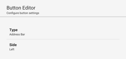
- Address Bar - Shows an address bar at the top of the KioWare browser for displaying or editing the URL of the current page. The address bar will also only accept “http://” or “https://”. If neither is supplied, the address will be prepended with “http://”.
- KioCall Button - Button for making a call to any user, kiosk, or group that has been set up (see Setting Up Toolbar Controls, Setting Up KioCall Button below). [For more details on KioCall, contact KioWare support staff via phone (Toll Free USA: 877-843-4790; International: 1-717-843-4790) or visit the KioWare website at m.kioware.com.]
- JS Console Button - Shows or hides the JavaScript console. Click and drag the console to dock at top, bottom, left, or right of the screen, or to undock (console is docked at bottom by default). Click and drag the edges of the console to resize it. The console will display information related to KioWare application event logs, including log type, description, page URL, and line number. The following log types can be used to filter logs:
- Debug
- Tip
- Log
- Warning
- Error
Use the “Clear” button to clear all logs from the console. [This setting is included in the KioWare for Android security/configuration audit; see Audit Tab, Toolbar, JavaScript Console.]
- Logcat Viewer Button - Shows or hides the Logcat Viewer in the KioWare browser. (For details on using an exit passcode to open the Logcat Viewer, see Security Tab, Exit Passcodes, Edit Additional Passcode, Exit Action, Open Logcat Viewer; for details on showing the Logcat Viewer from the Configuration Tool, see “Logcat Viewer” and “Device Support Logcat Viewer” under Configuration Tool, Configuration Toolbar, Dropdown Menu.) [This setting is included in the KioWare for Android security/configuration audit; see Audit Tab, Toolbar, Logcat Viewer.]
- System Time - Shows the system time on the KioWare for Android toolbar.
- Brightness - (Only available with Android 4.3 and higher) Sets the brightness of the user session. (See also Attract/Inactivity Tab, Screen Brightness for setting default screen brightness on session end.)
- Battery Indicator - Shows the tablet's remaining battery percentage when running KioWare for Android.
- KioTouch Access - Enables KioTouch technology, which allows users to interact with the kiosk screen using their own device.
- WiFi - Shows the status of the wireless network connection. (See also Security Tab, General Options, Wi-Fi Access Point List for setting up wireless network access points that KioWare for Android will remember and automatically try to connect to.)
Note: Controls that are buttons will automatically shrink down into one list button if there is not enough room on the toolbar for them. To change the order of toolbar controls in the toolbar, press an entry until it is highlighted and drag it up or down.
- Reorder Toolbar Control - Press an entry until it is highlighted and drag it up or down to reorder.
- Remove Toolbar Control (“minus” icon) - Select this icon to remove a toolbar control.
- Edit Toolbar Control (pencil icon) - Select this icon to edit a toolbar control. The Button Editor screen shows (see Setting Up Toolbar Controls below).
Setting Up Toolbar Controls
Toolbar controls include custom links, an address bar, app buttons, or other custom buttons. The Button Editor screen will show different settings based on the toolbar control being set up. These two settings apply to all controls.
- Type - Sets the type of docked element (browser window, toolbar, or spacer). Be sure “Toolbar” is selected.
- Side - Sets the position of the toolbar control on the toolbar (left or right).
Setting Up Home or Log Out Button
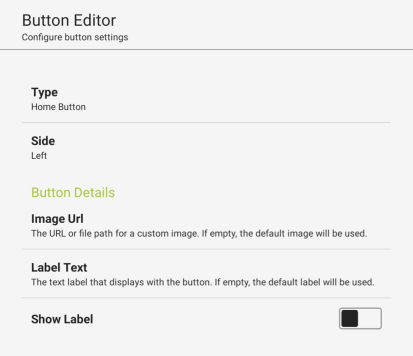
- Image Url - The URL or file path of a custom image to appear on the Home or Log Out button. If left blank, the default image will be used.
- Label Text - The text label that displays with the button on the KioWare for Android toolbar. This label also displays in the list of toolbar controls at the bottom of the User Interface tab.
- Show Label - If enabled, the label of the button will display.
Setting Up Custom Links
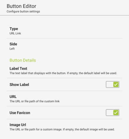
Note: Custom links can also be created from the Guided Setup. When setting up portals, videos, or KioCall via the Guided Setup, categories can also be added, assigned to buttons, or nested (see Configuration Tool, Configuration Toolbar, Dropdown Menu, Launch Guided Setup).
- Label Text - The text label that displays with the custom link button on the KioWare for Android toolbar. This label also displays in the list of toolbar controls at the bottom of the User Interface tab.
- Show Label - If enabled, the label of the custom link button will display.
- URL - The URL or file path of the custom link.
- Use Favicon - If checked, the icon (favicon) of the website you entered (see “URL” above) will automatically be used as the image for the custom link button. Note: This setting also shows in the Guided Setup when adding buttons (for apps, URLs, or KioCall) to a portal (see Configuration Tool, Configuration Toolbar, Dropdown Menu, Launch Guided Setup).
- Image Url - The URL or file path of a custom image to appear on the button. If left blank, the default image will be used.
Setting Up Toolbar JavaScript, Logcat Viewer, or Brightness Button
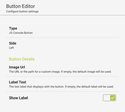
- Image Url - The URL or file path of a custom image to appear on the button. If left blank, the default image will be used.
- Label Text - The text label that displays with the custom JavaScript, Logcat Viewer, or brightness button on the KioWare for Android toolbar. This label also displays in the list of toolbar controls at the bottom of the User Interface tab.
- Show Label - If enabled, the label of the custom button will display.
Setting Up App Button
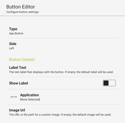
Note: App buttons can also be created from the Guided Setup. When setting up portals, videos, or KioCall via the Guided Setup, categories can also be added, assigned to buttons, or nested (see Configuration Tool, Configuration Toolbar, Dropdown Menu, Launch Guided Setup).
- Label Text - The text label that displays with the app button on the KioWare for Android toolbar. This label also displays in the list of toolbar controls at the bottom of the User Interface tab.
- Show Label - If enabled, the label of the app button will display.
- Application - Select the application that the button will access.
- Image Url - The URL or file path of a custom image to appear on the button. If left blank, the default image will be used.
- WARNING:
- Running external apps comes with security risks. Make sure the app you run is safe.
- We only support running apps when in admin mode if your app is also an admin app. This is for security and usability reasons.
Setting Up Address Bar
Setting Up KioCall Button
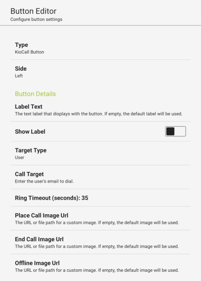
Note: KioCall buttons can also be created from the Guided Setup. When setting up portals, videos, or KioCall via the Guided Setup, categories can also be added, assigned to buttons, or nested (see Configuration Tool, Configuration Toolbar, Dropdown Menu, Launch Guided Setup).
- Label Text - The text label that displays with the KioCall button on the KioWare for Android toolbar. This label also displays in the list of toolbar controls at the bottom of the User Interface tab.
- Show Label - If enabled, the label of the KioCall button will display.
- Target Type - Sets the type of KioCall user that you want to call (available options are “User”, “Kiosk”, and “Group”). The option selected determines what can be entered in the “Call Target” setting (see below).
-
Call Target - Based on the “Target Type” (see above), specify who you want to call (see table below).
- Ring Timeout - The amount of time (in seconds) that a ringing call can go unanswered before it times out and stops ringing.
- Place Call Image Url - The URL or file path for a custom image. This image will show as the background for the button when a call is made using KioCall. The default image will be used if no image name is entered.
- End Call Image Url - The URL or file path for a custom image. This image will show as the background for the button when a call made with KioCall has ended. The default image will be used if no image name is entered.
- Offline Image Url - The URL or file path for a custom image. This image will show as the background for the button when KioCall is offline. The default image will be used if no image name is entered.
- WARNING:
- Running external apps comes with security risks. Make sure the app you run is safe.
- We only support running apps when in admin mode if your app is also an admin app. This is for security and usability reasons.
Setting Up System Time or Battery Indicator Button
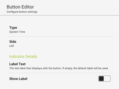
- Label Text - The text label that displays with the system time or battery indicator button on the KioWare for Android toolbar. This label also displays in the list of toolbar controls at the bottom of the User Interface tab.
- Show Label - If enabled, the label of the button will display.
Setting Up KioTouch Access Control
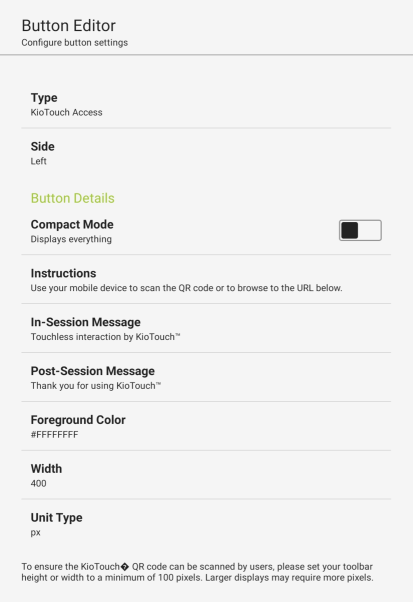
- Compact Mode - If enabled, the KioTouch Access control will only show the QR code and optional PIN.
- Instructions - (Only available when “Compact Mode” above is unchecked) These instructions will show on the control at the start of a user session. KioWare for Android provides default text, but custom text can also be entered.
- In-Session Message - (Only available when “Compact Mode” above is unchecked) This message will show on the control during a user session. KioWare for Android provides default text, but custom text can also be entered.
- Post-Session Message - (Only available when “Compact Mode” above is unchecked) This message will show on the control after a user session has ended. KioWare for Android provides default text, but custom text can also be entered.
- Foreground Color - (Only available when “Compact Mode” above is unchecked) Sets the foreground color of the control (white is default).
- Width - (Only available when “Compact Mode” above is unchecked) Sets the width of the control (400 is default).
- Unit Type - Set the unit for the width (pixels or percentage; px is default).
Setting Up WiFi Button
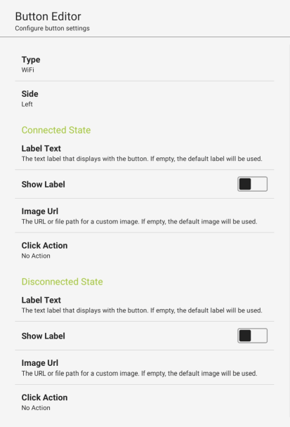
- Connected State - These settings specify how the button behaves when WiFi is connected.
- Label Text - The text label that displays with the WiFi button on the KioWare for Android toolbar. This label will only show when the button is in the “on” state.
- Show Label - If enabled, the label will show on the toolbar, below the button.
- Image Url - The URL or file path of a custom image to appear on the button. If left blank, the default image will be used.
- Click Action - Sets the action performed when the button is clicked.
- No Action - Used if setting up a WiFi indicator button.
- Show SSID on click - Shows the service set identifier (SSID, or the access point name; see Security Tab, Wi-Fi Access Point List, Edit Access Point, Wi-Fi SSID).
- Show WiFi Manager - Opens the WiFi Manager (used to connect WiFi, view details on existing connections such as their security, set up networks, manage connected devices, etc.).
- Disconnected State - These settings specify how the button behaves when WiFi is disconnected.
- Label Text - The text label that displays with the WiFi button on the KioWare for Android toolbar. This label will only show when the button is in the “off” state.
- Show Label - If enabled, the label will show on the toolbar, below the button.
- Image Url - The URL or file path of a custom image to appear on the button. If left blank, the default image will be used.
- Click Action - Sets the action performed when the button is clicked.
- No Action - Used if setting up a WiFi indicator button.
- Show SSID on click - Shows the service set identifier (SSID, or the access point name; see Security Tab, Wi-Fi Access Point List, Edit Access Point, Wi-Fi SSID).
- Show WiFi Manager - Opens the WiFi Manager (used to connect WiFi, view details on existing connections such as their security, set up networks, manage connected devices, etc.).
Setting Up Other Action Buttons
These settings show for the following buttons: Busy Indicator, Back, Forward, and Refresh.
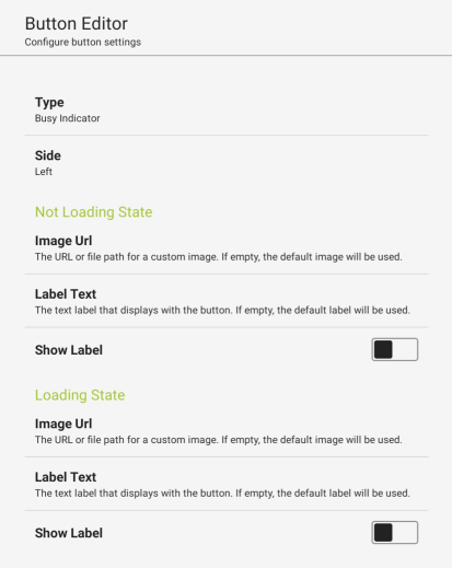
- Not Loading State
- Image Url - The URL or file path of a custom image to appear on the button. If left blank, the default image will be used.
- Label Text - The text label for the connection type indicator when it is in the “off” state.
- Show Label - If enabled, the label will show on the toolbar, below the button.
- Loading State
- Image Url - The URL or file path for an image. This image will show as the background for the button when the connection type indicator is in the “on” state. You can use the default image that is available, or select the ellipsis button to change the image.
- Label Text - The text label for the connection type indicator when it is in the “on” state.
- Show Label - If enabled, the label will show on the toolbar, below the button.
Setting Up Multiple Spacers
This screen shows when you select the “Docked Element Settings” arrow button on the Edit Docked UI Element screen for spacers (see Edit Docked UI Element screen under Docked UI Elements above).
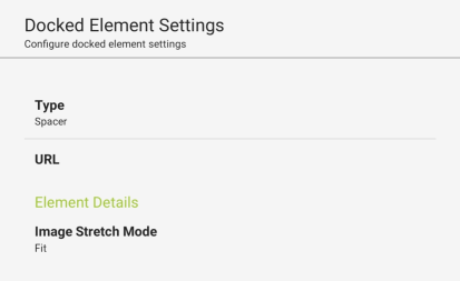
- Type - Sets the type of docked element (browser window, toolbar, or spacer). Be sure “Spacer” is selected.
- URL - Enter a website address or file path that will show in the docked spacer.
- Image Stretch Mode - Tells KioWare for Android if the background image should be stretched to fill the entire spacer or if it should show at its normal size.