Configuration Tool
See Related Terms and Questions at the end of this section for more details on the KioWare user interface.
User Interface Tab
The settings below appear on the main User Interface tab. This tab contains “Browser”, “Spacer”, and “Toolbar” buttons that show additional screens for adding docked browser windows, spacers, and toolbars to the main KioWare window. For details on these screens, see the sections for Setting Up Multiple Browser Windows, Setting Up Multiple Spacers, and Setting Up Multiple Toolbars that come after these User Interface tab settings.
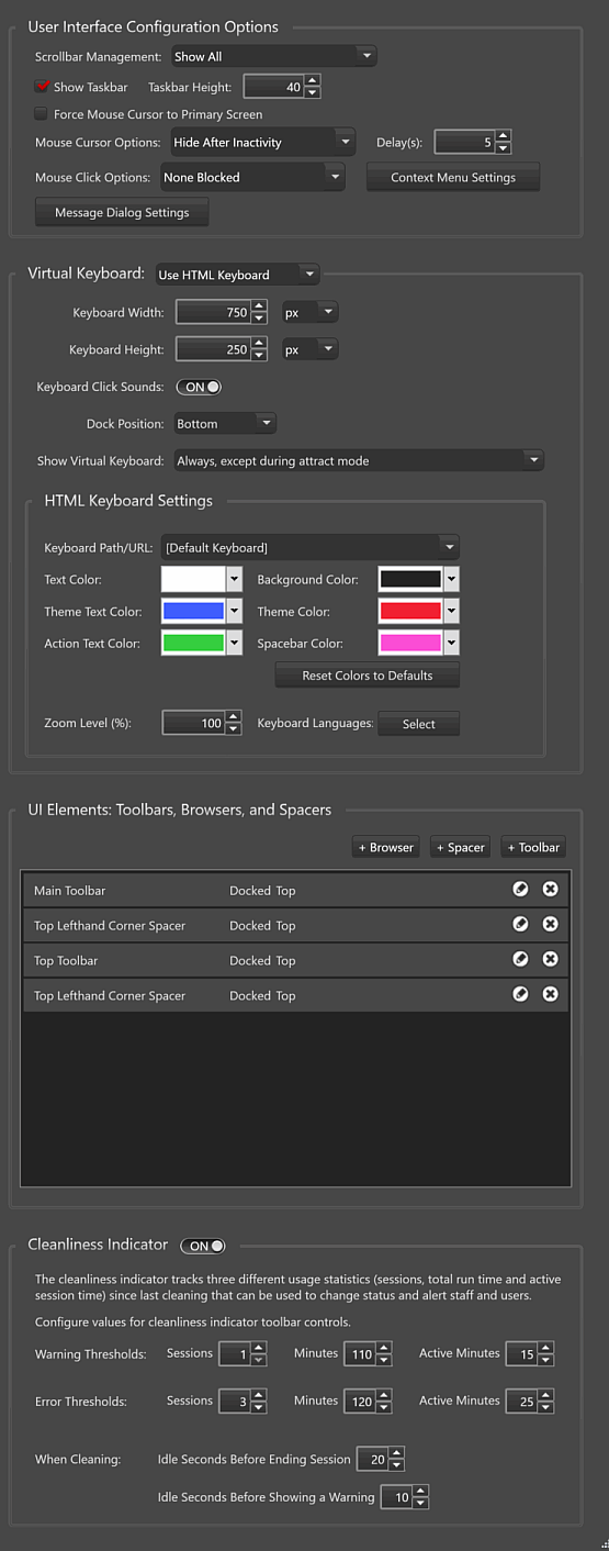
User Interface Configuration Options
- Scrollbar Management - Select how you want to handle main scrollbars (vertical and horizontal scrollbars that show when a website or application does not fit in a browser window of KioWare), div tags that allow scrolling for certain content within web pages, and scrollbars for frames and iframes (smaller browser windows that may be embedded in web pages).
- Show All - Shows all types of scrollbars (in browser windows, from div tags, and in frames/iframes).
- Hide Main - Hides only the main scrollbars (in browser windows).
- Show in Frames - Shows only scrollbars in frames/iframes.
- Hide All - Hides all types of scrollbars (in browser windows, from div tags, and in frames/iframes).
- Show Taskbar - If checked, KioWare will show a taskbar (much like the Windows taskbar).
- Taskbar Height - If “Show Taskbar” is checked, sets the height of the taskbar in pixels.
- Force Mouse Cursor to Primary Screen - If checked, the mouse cursor can only be used with the main screen of your kiosk and cannot be used with a secondary monitor (see Attract/Inactivity Tab, Additional Displays) or with multiple display spanning (see Advanced Tab, Advanced Settings Tab, Main Browser Multiple Display Spanning).
- Mouse Cursor Options - Sets if KioWare will show or hide the mouse cursor in the KioWare browser.
- Always Show - Always shows the cursor.
- Always Hide - Always hides the cursor. Note: This feature should only be used with a touchscreen or the Alt+F4 exit feature (see Keyboard Filtering Tab, Keyboard Filtering).
- Hide After Inactivity - Shows cursor initially and then hides it when the kiosk or computer has been inactive for the number of seconds set in the “Delay(s)” box (default is 5). Once hidden, the cursor shows again when moving or clicking a mouse (touchscreen and other user input will not show the cursor).
- Mouse Click Options - Sets how KioWare will respond when a user clicks a mouse in the KioWare browser.
- None Blocked - Does not block left or right clicks.
- Block Right Click Only - Blocks only right clicks.
- Note: When selecting the “None Blocked” option, the “Enable Context Menu” checkbox (see Context Menu Settings, Enable Context Menu below) must also be checked in order for context menus to show when right clicking in the KioWare browser. If this checkbox is already checked and you try to select the “Block Right Click Only” option, you will see this warning. Select “Yes” to block right clicking and automatically uncheck the checkbox.
- Context Menu Settings - Select this button to set up items in the context menu (see Context Menu Settings below).
- Message Dialog Settings - Select this button to set colors and fonts for message popup windows (alerts about overriding defaults, windows to prompt users to take an action, windows to confirm that users really do want to take an action, etc.). The Message Dialog Settings window shows these settings. In each color dropdown, either Hex or RGB colors can be set, and the bottom slider (labeled “A”) sets the opacity/transparency of the color.
- Message Text Color - Sets the text color in the main body of all messages.
- Title Text Color - Sets the text color in the title of all popup windows.
- Button Text Color - Sets the color of all button labels.
- Button Border Color - Sets the color of all button borders.
- Border Color - Sets the color of borders for all popup windows.
- Background Color - Sets the background color for all popup windows (does not include backgrounds of buttons or boxes for entering data).
- Footer Background Color - Sets the color of footers in all popup windows. This also sets the background color of all buttons.
- Input Background Color - Sets the background color of all boxes for entering data.
- Input Border Color - Sets the border color of all boxes for entering data.
- Title Font - Sets the font of the title in all popup windows.
- Message Font - Sets the font used in the main body of all messages.
- Button Font - Sets the font for all button labels.
- Input Font - Sets the font used when entering data in all text entry boxes.
Virtual Keyboard
In the dropdown, select an option for showing a virtual keyboard when running the KioWare browser. (See also Assistive Technologies Tab, KioTouchTM Support, Enable Keyboard on User's Mobile Device Screen.)
- [Disabled] - Turns off and hides the virtual keyboard.
- Use HTML Keyboard - Shows KioWare's built-in HTML keyboard.
- Use Hot Virtual Keyboard - Shows Hot Virtual Keyboard.
When not disabled, you can enter these settings.
- Keyboard Width - Sets the width of the virtual keyboard in units.
- Keyboard Height - Sets the height of the virtual keyboard in units.
- Keyboard Click Sounds - Set the slider to “ON” (default) to hear sound when pressing buttons on the virtual keyboard (or set to “OFF” to disable it).
- Dock Position - Sets the position where the virtual keyboard is docked (top or bottom).
- Show Virtual Keyboard - Tells KioWare when to show the virtual keyboard.
- When requested via keyboard toolbar button or JavaScript - The keyboard shows only when a user selects the keyboard button on the KioWare browser toolbar (see Setting Up Multiple Toolbars, Customizing Other Action Buttons below) or uses the KioApp.StartKeyboard JavaScript function (see “JavaScript”, “KioApp”, “Methods”, “StartKeyboard” in the API Docs).
- Automatically when a text field is clicked - The keyboard shows only when a user places a mouse cursor in a text entry box (or touches inside a text entry box on a touchscreen). Note: When the KioVkDisable attribute exists on an input element (e.g., textbox), KioWare will not show a virtual keyboard when that element is selected (or gets input focus when a page loads).
- Always, except during attract mode - The keyboard is always shown, except when the kiosk or computer is in Attract Screen mode (see Attract/Inactivity Tab, Attract Screen Mode).
HTML Keyboard Settings
When the virtual keyboard dropdown is set to “Use HTML Keyboard”, you can also enter these settings.
- Keyboard Path/URL - Select the type of HTML keyboard (default or Android's Material) and enter the file path or URL for the keyboard.
- Text Color - Color of the label on all keyboard keys that are used to enter text (e.g., does not apply to the Enter key and keys used to delete, search, and switch between numbers and letters).
- Background Color - Background color of the keyboard.
- Theme Text Color - When a keyboard has a certain theme, the label on some keys will show in this color. The theme itself tells KioWare which keys will have labels in this color (typically the Enter key and keys to switch between capital and lowercase letters) and if this color will show when the keyboard opens or only when a key is pressed.
- Theme Color - When a keyboard has a certain theme, the background on some keys will show in this color. The theme itself tells KioWare which keys will have backgrounds in this color (typically the Enter key and keys to switch between capital and lowercase letters) and if this background color will show when the keyboard opens or only when a key is pressed.
- Action Text Color - Color of labels on keys used to perform actions other than entering text (e.g., the Enter key and keys used to delete, switch between numbers and letters, and switch between capitals and lowercase letters).
- Spacebar Color - Color of the spacebar key.
- Reset Colors to Defaults - Select this button to reset all of the above colors to their defaults.
- Zoom Level - Sets the zoom percentage for the keyboard.
- Keyboard Languages - Select this button to tell KioWare which languages you want your keyboard to be able to use. On the window that shows, select a language from the bottom left dropdown and then select the “Add Language” button. Do this for each language you want to use. All languages selected will appear in the list above. Whenever you display a virtual keyboard while running KioWare, you can use a special button on the keyboard to switch to any other language selected on this window (see image below). All key labels and anything you enter (including character combinations) will be in this language.
Below is one example of how the keyboard can look. The “Keyboard Path/URL” is set to “[Default Keyboard]”, and these color settings are used:
- “Text Color” of #FFF5F0F0 (shade of white)
- “Theme Text Color” of #FF2A1DBF (shade of bright blue)
- “Action Text Color” of #FF4ED43A (shade of bright green)
- “Background Color” of #FF222222 (shade of black)
- “Theme Color” of #FFCD202C (shade of red)
- “Spacebar Color” of #FFF211D4 (shade of purple)
The keyboard icons at the bottom left and bottom right are used to close the keyboard.

UI Elements: Toolbars, Browsers, and Spacers
- Browser - Select this button to show settings for adding a new docked browser window (see Setting Up Multiple Browser Windows below).
- Spacer - Select this button to show settings for adding a new spacer (see Setting Up Spacers below).
- Toolbar - Select this button to show settings for adding a new toolbar (see Setting Up Multiple Toolbars below).
- Edit Browser/Spacer/Toolbar (pencil icon) - Select this icon to change the settings for a docked browser window, spacer, or toolbar.
- Delete Browser/Spacer/Toolbar (“X” icon) - Select this icon to remove a docked browser window, spacer, or toolbar.
Cleanliness Indicator
When the slider is set to “ON”, the settings below will become available. Then, based on when the kiosk or computer was last cleaned, usage statistics can be tracked (see settings below) and toolbar controls can be set up to show status alerts (see Setting Up Multiple Toolbars, Customizing Cleanliness Indicator). Exit actions can be used to set up a passcode that activates User Interface (UI) Cleaning mode and resets all timers for the “Cleanliness Indicator” (see General Tab, Exit Passcodes, Add Exit Passcode, Exit Action, UI Cleaning Mode).
Setting the slider to “OFF” will automatically disable (but not remove) any toolbar controls for showing cleanliness status alerts and any exit actions for activating UI Cleaning mode and resetting “Cleanliness Indicator” timers.
- Warning Thresholds - Set the criteria for when KioWare will indicate warning status that the kiosk/computer should soon be cleaned. When the warning threshold is reached, the “Cleanliness Indicator” toolbar control (see Setting Up Multiple Toolbars, Customizing Cleanliness Indicator) will change status accordingly.
- Sessions - The number of user sessions before entering warning status.
- Minutes - The number of minutes before entering warning status.
- Active Minutes - The number of minutes of active session time before entering warning status.
- Error Thresholds - Set the criteria for when KioWare will indicate error status that the kiosk/computer should be cleaned. When the error threshold is reached, the “Cleanliness Indicator” toolbar control (see Setting Up Multiple Toolbars, Customizing Cleanliness Indicator) will change status accordingly.
- Sessions - The number of user sessions before entering error status.
- Minutes - The number of minutes before entering error status.
- Active Minutes - The number of minutes of active session time before entering error status.
- When Cleaning - Set the criteria for how long KioWare will show the cleaning screen once it has entered UI Cleaning mode.
- Idle Seconds Before Ending Session - The amount of time (in seconds) that cleaning must be paused before KioWare exits UI Cleaning mode and returns to the kiosk application.
- Idle Seconds Before Showing a Warning - The amount of time (in seconds) that cleaning must be paused before a warning timer appears, counting down the time remaining until KioWare exits UI Cleaning mode and returns to the kiosk application.
Cleaning the Kiosk
Once the “Cleanliness Indicator” setting is enabled (see Cleanliness Indicator above), an exit passcode can be set for activating UI Cleaning mode (see General Tab, Exit Passcodes, Add Exit Passcode, Exit Action, UI Cleaning Mode), and a toolbar control can be set up to show status alerts (see Setting Up Multiple Toolbars, Customizing Cleanliness Indicator). Then the procedure for cleaning the kiosk/computer will be as follows:
- During use of the kiosk/computer (including inactivity between user sessions), the threshold timers will count up to the values set for warning and error thresholds (see Cleanliness Indicator above). Timers will not show on the KioWare browser toolbar unless the “Show Detail Label” checkbox is checked on the Toolbar Control Editor, which will only show the session counter (see Setting Up Multiple Toolbars, Customizing Cleanliness Indicator).
- The user who is cleaning can then show the exit window (see Quick Start Guide, KioWare Browser, Exit the Browser) but, instead of exiting, will enter the UI Cleaning mode passcode (see General Tab, Exit Passcodes, Add Exit Passcode, Exit Action, UI Cleaning Mode) to show the cleaning notification screen. All timers for the “Cleanliness Indicator” setting are automatically reset (see Cleanliness Indicator above).
- When the touch screen is being cleaned, this registers as user input that keeps the cleaning notification screen showing. A pause in cleaning starts the idle seconds timer (which is hidden; see Cleanliness Indicator, When Cleaning above).
- When there is a pause in cleaning that lasts the number of seconds set in “Idle Seconds Before Showing a Warning” above, the notification screen then shows the idle seconds timer and an alert that cleaning has stopped.
- If cleaning is resumed, the notification screen will hide the alert and timer, which will automatically reset.
- If no further cleaning is needed, then let the kiosk/computer sit idle. When the timer counts up to the value of “Idle Seconds Before Ending Session” above, UI Cleaning mode will end and the kiosk/computer will return to the kiosk application.
Setting Up Multiple Browser Windows
This screen is shown when you select the “Browser” button on the main User Interface tab (see User Interface Tab above). It also shows when you select the pencil icon for a docked browser window.
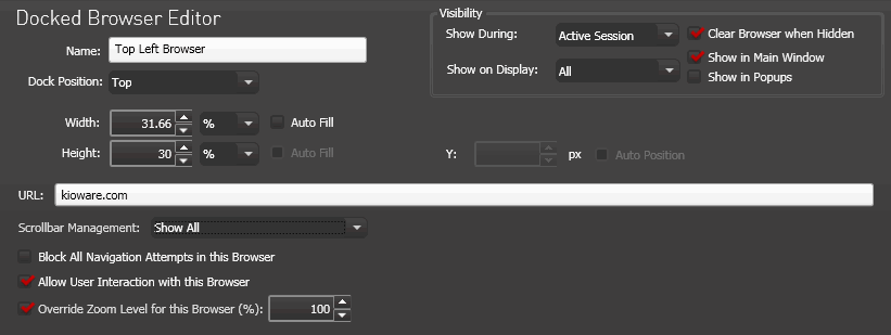
- Name - Enter a name for the docked browser window.
- Docked Position - Sets the docked position of the docked browser window (Top, Bottom, Left, or Right).
- Visibility - Settings to tell KioWare when to show or hide the docked browser window and the things that are showing in it.
- Show During - Tells KioWare when to show the docked browser window (never, always, during an active user session, or during Attract Screen mode).
- Show on Display - Tells KioWare which additional displays should show or hide the docked browser window (for more details on additional displays, see Attract/Inactivity Tab, Related Terms and Questions).
- Clear Browser when Hidden - If checked, when the docked browser window is hidden (e.g., if set to hide when entering Attract Screen mode), it navigates to the blank browser page (about:blank) and later reloads the prior page when shown again.
- Show in Main Window - If checked, the docked browser window will show in the main KioWare window.
- Show in Popups - If checked, the docked browser window will show in all popups (e.g., when selecting a link that is set up to open the main KioWare window in a new popup).
- Width - Sets the width of the docked browser window (width can be set in pixels or percentage).
- Auto Fill - If checked, instead of using the width setting, the docked browser window will attempt to fill the available width. For example, you could have a toolbar that is 200 px wide and create a docked browser set to “Auto Fill” to fill the rest of the space.
- Height - Sets the height of the docked browser window (height can be set in pixels or percentage).
- Auto Fill - If checked, instead of using the height setting, the docked browser window will attempt to fill the available height. For example, you could have a toolbar that is 200 px high and create a docked browser set to “Auto Fill” to fill the rest of the space.
- URL - Enter a website address or file path that will show in the docked browser window.
- Scrollbar Management - Select how you want to handle main scrollbars (vertical and horizontal scrollbars that show when a website or application does not fit in a browser window of KioWare), div tags that allow scrolling for certain content within web pages, and scrollbars for frames and iframes (smaller browser windows that may be embedded in web pages).
- Show All - Shows all types of scrollbars (in browser windows, from div tags, and in frames/iframes).
- Hide Main - Hides only the main scrollbars (in browser windows).
- Show in Frames - Shows only scrollbars in frames/iframes.
- Hide All - Hides all types of scrollbars (in browser windows, from div tags, and in frames/iframes).
- Block All Navigation Attempts in this Browser - If checked, users cannot open and view any other web pages/files in this docked browser, or use the browser navigation buttons (Home, Back, and Forward).
- Allow User Interaction with this Browser - If checked, users can interact with the docked browser window (enter text in textboxes, show dropdown menus, select buttons, etc.).
- Override Zoom Level for this Browser - If checked, instead of using the default zoom level (see Browser Tab, General Browser Settings, Zoom Level), the docked browser window will use the zoom percentage entered to the right.
Setting Up Multiple Spacers
This screen is shown when you select the “Spacer” button on the main User Interface tab (see User Interface Tab above). It also shows when you select the pencil icon for a spacer.
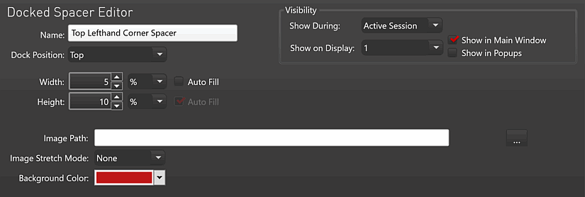
- Name - Enter a name for the spacer.
- Docked Position - Sets the docked position of the spacer (Top, Bottom, Left, or Right).
- Visibility - Settings to tell KioWare when to show or hide the spacer and the things that are showing in it.
- Show During - Tells KioWare when to show the spacer (never, always, during an active user session, or during Attract Screen mode).
- Show on Display - Tells KioWare which additional displays should show or hide the spacer (for more details on additional displays, see Attract/Inactivity Tab, Related Terms and Questions).
- Show in Main Window - If checked, the spacer will show in the main KioWare window.
- Show in Popups - If checked, the spacer will show in all popups (e.g., when selecting a link that is set up to open the main KioWare window in a new popup).
- Width - Sets the width of the spacer (width can be set in pixels or percentage).
- Auto Fill - If checked, instead of using the width setting, the spacer will attempt to fill the available width. For example, you could have a docked browser that is 500 px wide and create a spacer set to “Auto Fill” to fill the rest of the space.
- Height - Sets the height of the spacer (height can be set in pixels or percentage).
- Auto Fill - If checked, instead of using the height setting, the spacer will attempt to fill the available height. For example, you could have a docked browser that is 500 px high and create a spacer set to “Auto Fill” to fill the rest of the space.
- Image Path - Enter the URL or file path of a background image for the spacer.
- Image Stretch Mode - Tells KioWare if the background image should be stretched to fill the entire spacer or if it should show at its normal size.
- Background Color - Sets the background color for the spacer.
Setting Up Multiple Toolbars
This screen is shown when you select the “Toolbar” button on the main User Interface tab (see User Interface Tab above) or when you select the pencil icon for a toolbar. When using the “Toolbar” button, you are asked if you want to create a default or blank toolbar. The default toolbar contains the busy indicator and the address bar on the left and these buttons on the right: Back, Forward, Home, Refresh/Stop, and Log Off. A blank toolbar does not contain any buttons or features.
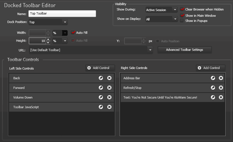
- Name - Enter a name for the toolbar.
- Docked Position - Sets the docked position of the toolbar (Top, Bottom, Left, or Right).
- Visibility - Settings to tell KioWare when to show or hide the toolbar and the things that are showing in it.
- Show During - Tells KioWare when to show the toolbar (never, always, during an active user session, or during Attract Screen mode).
- Show on Display - Tells KioWare which additional displays should show or hide the toolbar (for more details on additional displays, see Attract/Inactivity Tab, Related Terms and Questions).
- Clear Browser when Hidden - If checked, when the toolbar is hidden (e.g., if set to hide when entering Attract Screen mode), it navigates to the blank browser page (about:blank) and later reloads the toolbar when shown again (toolbars are a type of browser window and will navigate to about:blank, the same as any other docked browser window).
- Show in Main Window - If checked, the toolbar will show in the main KioWare window.
- Show in Popups - If checked, the toolbar will show in all popups (e.g., when selecting a link that is set up to open the main KioWare window in a new popup).
- Width - Sets the width of the toolbar (width can be set in pixels or percentage).
- Auto Fill - If checked, instead of using the width setting, the toolbar will attempt to fill the available width. For example, you could have a docked browser that is 500 px wide and create a toolbar set to “Auto Fill” to fill the rest of the space.
- Height - Sets the height of the toolbar (height can be set in pixels or percentage).
- Auto Fill - If checked, instead of using the height setting, the toolbar will attempt to fill the available height. For example, you could have a docked browser that is 500 px high and create a toolbar set to “Auto Fill” to fill the rest of the space.
- URL - Enter an address or file path to the toolbar, or use the default.
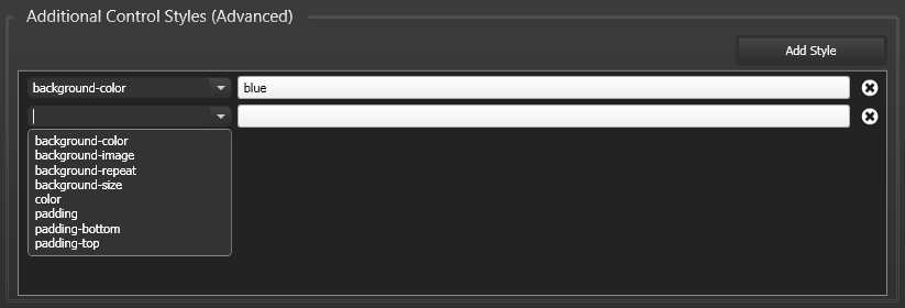
- Advanced Toolbar Settings - (For advanced users only) Select this button to evenly space controls on your toolbar and add additional control styles (this sets up additional styles for a cascading style sheet, or CSS). The Advanced Toolbar Settings window shows these settings.
- Evenly Space Controls - If checked, all controls (buttons, address bar, indicators, pictures, etc.) on your toolbar will have the same amount of space between them.
- Add Style - Select this button to add a new style entry in the pane.
- Style Item (arrow button) - Use this button to select the style item you want to set up. These items are available.
- Background color - Color of toolbar and any buttons on it.
- Background image - Background image for toolbar.
- Background repeat - Repeats a background image across the entire toolbar.
- Background size - Background size of the entire toolbar.
- Color - Color of text labels for all toolbar buttons.
- Padding - Amount of space between each edge of the toolbar and the edges of the buttons, boxes, etc. that the toolbar contains.
- Padding bottom - Amount of space between the top edge of the toolbar and the top edges of the buttons, boxes, etc. that the toolbar contains.
- Padding top - Amount of space between the bottom edge of the toolbar and the bottom edges of the buttons, boxes, etc. that the toolbar contains.
- Style - Set the style for the item like this.
- For color items, enter a specific hex value (e.g., #8B0000) or name (e.g., red).
- For image items, enter the URL or file path of the image.
- For padding items, enter the amount of space in this format: 10px (no space between value and px).
- Delete (“X” icon) - Select this icon to remove a style item.
Adding/Deleting Toolbar Controls
- Add Control - Select this button to add a control to the toolbar. These are the types of controls you can add.
- Action Button (browse back/forward, custom link, keyboard, scroll buttons, volume buttons, etc.)
- Address Bar
- Battery State
- Cleanliness Indicator (requires that the “Cleanliness Indicator” setting be enabled on the main User Interface Tab; see Cleanliness Indicator above)
- IFrame
- KioTouch Access
- Multistate Indicator (busy indicator, call with KioCall, connection type, refresh/stop, scroll lock state, etc.)
- Picture
- Session Timer (shows the time remaining in a user session before auto-logoff)
- System Clock
- Text
- Delete (“X” icon) - Select this icon to delete a control from the toolbar.
Setting Up Custom Links
This screen is shown when you select the pencil icon for a custom link listed in the Toolbar Controls pane.

- Label - The text label for the custom link.
- Show Label - If checked, the label will show on the toolbar, below the custom link.
- Image - The URL or file path for an image. This image will show as the background for the custom link. You can use the default image that is available, select the ellipsis button to change the image, or use the site's favicon (icon) by checking the “Use favicon” checkbox (see below).
- Use Favicon - If checked, the icon (favicon) of the website you entered will automatically be used as the image for the custom link button.
- Click Action - For a custom link, this should be set to “Custom Link”.
- URL - Enter the URL or file path for the link.
For details on adding control styles to your custom links, see Adding Control Styles below.
Setting Up Toolbar JavaScript
This screen is shown when you select the pencil icon for a toolbar JavaScript control listed in the Toolbar Controls pane. Enter your custom JavaScript in the “JavaScript to Execute” box, and this custom link will run directly from your toolbar (not from the KioWare browser window).

Customizing Other Action Buttons
This screen is shown when you select the pencil icon for any action button (except a custom link and toolbar JavaScript control) listed in the Toolbar Controls pane. (Shown below is the screen for the “Scroll Left” button.)
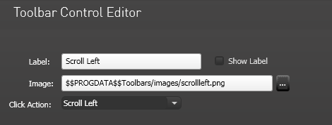
- Label - The text label for the action button.
- Show Label - If checked, the label will show on the toolbar, below the button.
- Image - The URL or file path for an image. This image will show as the background for the button. You can use the default image that is available, or select the ellipsis button to change the image.
- Click Action - This dropdown will show the action for the button you selected under “Add Control”, “Action Button”. You can change the button's action if you want to or keep the default.
The above settings apply to these action buttons. For details on adding control styles to your custom action buttons, see Adding Control Styles below.
| Browse Back | Moves back one page or screen in the browser |
| Browse Forward | Moves forward one page or screen in the browser |
| Exit | Exits KioWare |
| Home | Returns to the Start Page (see General Tab, Start Page URL) |
| Keyboard | Shows/hides the virtual keyboard (see Virtual Keyboard above) |
| Log Off | Ends the current KioWare user session |
| None | Sets up a placeholder on the toolbar that can include an image and label but does nothing if selected |
| Page Down | Scrolls down a set number of lines (usually one page of content, but may be different in certain software applications) |
| Page Up | Scrolls up a set number of lines (usually one page of content, but may be different in certain software applications) |
| Print | Prints from the currently displayed page or screen |
| Refresh | Reloads the currently displayed page or screen |
| Screen Zoom In | Increases the zoom percentage of the ZoomText® Magnifier (see also Assistive Technologies Tab for details on enabling ZoomText for use with KioWare and for other assistive software/devices that run with KioWare) |
| Screen Zoom Out | Decreases the zoom percentage of the ZoomText® Magnifier (see also Assistive Technologies Tab for details on enabling ZoomText for use with KioWare and for other assistive software/devices that run with KioWare) |
| Scroll Down | Scrolls down one line |
| Scroll Left | Scrolls left for a set number of characters |
| Scroll Right | Scrolls right for a set number of characters |
| Scroll Up | Scrolls up one line |
| Stop | Stops an action (e.g., loading a page) that is in progress |
| Volume Down | Decreases the system volume |
| Volume Up | Increases the system volume |
| Zoom In | Increases the zoom percentage |
| Zoom Out | Decreases the zoom percentage |
Customizing Address Bar
This screen is shown when you select the pencil icon for an address bar listed in the Toolbar Controls pane.
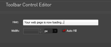
- Width - Sets up the width of the address bar.
- Auto Fill - If checked, instead of using the width setting, the address bar will attempt to fill the available width.
For details on adding control styles to your custom address bar, see Adding Control Styles below.
Customizing Battery State
This screen is shown when you select the pencil icon for a battery state control listed in the Toolbar Controls pane.
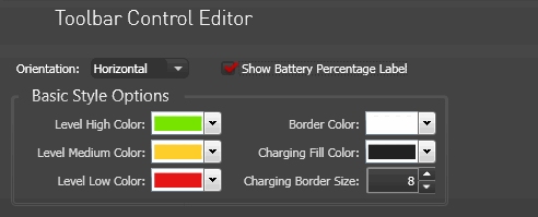
- Orientation - Set the orientation of the battery state control (horizontal or vertical, horizontal is default).
- Show Battery Percentage Label - If checked, the battery state control shows a label to indicate the percentage of battery charge remaining.
Basic Style Options
- Level High Color - Set the color of the battery state control when the battery charge is more than 66%.
- Level Medium Color - Set the color of the battery state control when the battery charge is between 16% and 66%.
- Level Low Color - Set the color of the battery state control when the battery charge is less than or equal to 15%.
- Border Color - Set the color of the border for the battery state control.
- Charging Fill Color - Set the color of the battery state control when the battery is being charged.
- Charging Border Size - Set the thickness of the border for the battery state control when the battery is being charged.
For details on adding control styles to your custom battery state control, see Adding Control Styles below.
Customizing Cleanliness Indicator
Note: Attempting to add a cleanliness indicator control when the “Cleanliness Indicator” setting (see Cleanliness Indicator above) is set to “OFF” will show a popup window with a warning. Select “Yes” on this window, and a second popup window confirms that the “Cleanliness Indicator” has been enabled and the toolbar control can be added.
This screen is shown when you select the pencil icon for a cleanliness indicator control listed in the Toolbar Controls pane.

- Show Detail Label - If checked, the session counter (number of sessions since the last cleaning) for the “Cleanliness Indicator” setting (see Cleanliness Indicator above) will show on the control.
Customizing IFrame
This screen is shown when you select the pencil icon for an iframe control listed in the Toolbar Controls pane.

- Width - Sets the width of the iframe (width can be set in pixels or percentage).
- Auto Fill - If checked, instead of using the width setting, the iframe will attempt to fill the available width. For example, you could have a docked browser that is 500 px wide and create an iframe set to “Auto Fill” to fill the rest of the space.
- Height - Sets the height of the iframe (height can be set in pixels or percentage).
- Auto Fill - If checked, instead of using the height setting, the iframe will attempt to fill the available height. For example, you could have a docked browser that is 500 px high and create an iframe set to “Auto Fill” to fill the rest of the space.
- URL - Enter a URL or path to a file that will show in the iframe.
For details on adding control styles to your custom iframe, see Adding Control Styles below.
Customizing KioTouchTM Access
This screen is shown when you select the pencil icon for a KioTouchTM access control listed in the Toolbar Controls pane.
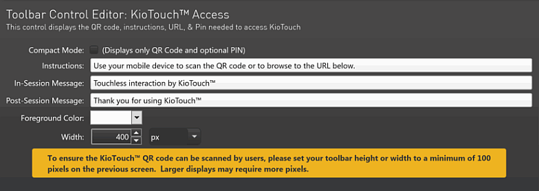
- Compact Mode - If checked, the control will only show the QR code and optional PIN.
- Instructions - (Only available when “Compact Mode” above is unchecked) These instructions will show on the control at the start of a user session. KioWare provides default text, but custom text can also be entered.
- In-Session Message - (Only available when “Compact Mode” above is unchecked) This message will show on the control during a user session. KioWare provides default text, but custom text can also be entered.
- Post-Session Message - (Only available when “Compact Mode” above is unchecked) This message will show on the control after a user session has ended. KioWare provides default text, but custom text can also be entered.
- Foreground Color - (Only available when “Compact Mode” above is unchecked) Sets the foreground color of the control (white is default).
- Width - (Only available when “Compact Mode” above is unchecked) Sets the width of the control (width can be set in pixels or percentage; 400 px is default).
Note: To ensure the KioTouchTM QR code can be scanned by users, set the toolbar height or width to a minimum of 100 pixels (see “Width” and “Height” under Setting Up Multiple Toolbars above). Larger displays may require more pixels.
For details on adding control styles to your custom KioTouchTM access control, see Adding Control Styles below.
Customizing Call with KioCall State
This screen is shown when you select the pencil icon for a Call with KioCall control listed in the Toolbar Controls pane.
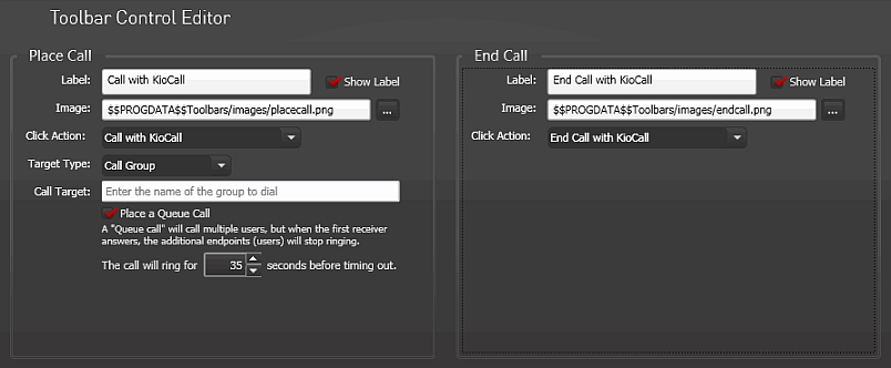
Place Call
- Label - The text label for the Call with KioCall indicator when it is in the “on” state.
- Show Label - If checked, the label will show on the toolbar, below the button.
- Image - The URL or file path for an image. This image will show as the background for the button when the Call with KioCall indicator is in the “on” state. You can use the default image that is available, or select the ellipsis button to change the image.
- Click Action - For a Call with KioCall indicator, this should be set to “Call with KioCall”.
- Target Type - Sets the type of KioCall user that you want to call (available options are “Call Group”, “Call Kiosk”, and “Call User”). The option selected determines what can be entered in the “Call Target” (see below).
- Call Target - Based on the “Target Type” (see above), specify who you want to call (see table below).
-
| Target Type | Call Target |
| Call Group | Any group name that you have created via the KioCall Admin |
| Call Kiosk | Any kiosk (or computer) name that has KioWare installed with a valid KioCall Authorization Key |
| Call User | Any user's email address that you have created via the KioCall Admin |
- Place a Queue Call - (Only available when “Target Type” is set to “Call Group”) If checked, you can call multiple users, but when one user answers, KioCall will stop ringing the rest of the users.
- The call will ring for [X] seconds before timing out - The amount of time (in seconds) that a ringing call can go unanswered before it times out and stops ringing.
End Call
- Label - The text label for the Call with KioCall indicator when it is in the “off” state.
- Show Label - If checked, the label will show on the toolbar, below the button.
- Image - The URL or file path for an image. This image will show as the background for the button when the Call with KioCall indicator is in the “off” state. You can use the default image that is available, or select the ellipsis button to change the image.
- Click Action - For a Call with KioCall indicator, this should be set to “End Call with KioCall”.
For details on adding control styles to your custom Call with KioCall indicators, see Adding Control Styles below.
Customizing Caps Lock State
This screen is shown when you select the pencil icon for a caps lock multistate indicator listed in the Toolbar Controls pane.

Caps Lock Off
- Label - The text label for the caps lock indicator when it is in the “off” state.
- Show Label - If checked, the label will show on the toolbar, below the button.
- Image - The URL or file path for an image. This image will show as the background for the button when the caps lock indicator is in the “off” state. You can use the default image that is available, or select the ellipsis button to change the image.
- Click Action - For a caps lock indicator, this should be set to “Caps Lock On”.
Caps Lock On
- Label - The text label for the caps lock indicator when it is in the “on” state.
- Show Label - If checked, the label will show on the toolbar, below the button.
- Image - The URL or file path for an image. This image will show as the background for the button when the caps lock indicator is in the “on” state. You can use the default image that is available, or select the ellipsis button to change the image.
- Click Action - For a caps lock indicator, this should be set to “Caps Lock Off”.
For details on adding control styles to your custom caps lock indicators, see Adding Control Styles below.
Customizing Connection Type
This screen is shown when you select the pencil icon for a connection type multistate indicator listed in the Toolbar Controls pane. The Internet connection to your kiosk or computer will automatically be detected, and this control will then indicate the connection type: Ethernet, Wi-Fi, Cellular, or None.

Disconnected
- Label - The text label for the connection type indicator when it is in the “off” state.
- Show Label - If checked, the label will show on the toolbar, below the button.
- Image - The URL or file path for an image. This image will show as the background for the button when the connection type indicator is in the “off” state. You can use the default image that is available, or select the ellipsis button to change the image.
- Click Action - For a connection type indicator, this should be set to “None”.
Connected
- Label - The text label for the connection type indicator when it is in the “on” state.
- Show Label - If checked, the label will show on the toolbar, below the button.
- Image - The URL or file path for an image. This image will show as the background for the button when the connection type indicator is in the “on” state. You can use the default image that is available, or select the ellipsis button to change the image.
- Click Action - For a connection type indicator, this should be set to “None”.
For details on adding control styles to your custom connection indicator, see Adding Control Styles below.
Customizing Num Lock State
This screen is shown when you select the pencil icon for a num lock multistate indicator listed in the Toolbar Controls pane.

Num Lock Off
- Label - The text label for the num lock indicator when it is in the “off” state.
- Show Label - If checked, the label will show on the toolbar, below the button.
- Image - The URL or file path for an image. This image will show as the background for the button when the num lock indicator is in the “off” state. You can use the default image that is available, or select the ellipsis button to change the image.
- Click Action - For a num lock indicator, this should be set to “Num Lock On”.
Num Lock On
- Label - The text label for the num lock indicator when it is in the “on” state.
- Show Label - If checked, the label will show on the toolbar, below the button.
- Image - The URL or file path for an image. This image will show as the background for the button when the num lock indicator is in the “on” state. You can use the default image that is available, or select the ellipsis button to change the image.
- Click Action - For a num lock indicator, this should be set to “Num Lock Off”.
For details on adding control styles to your custom num lock indicators, see Adding Control Styles below.
Customizing Screen Reader State
This screen is shown when you select the pencil icon for a screen reader multistate indicator listed in the Toolbar Controls pane. Currently, these settings are only for the JAWS® screen reader.
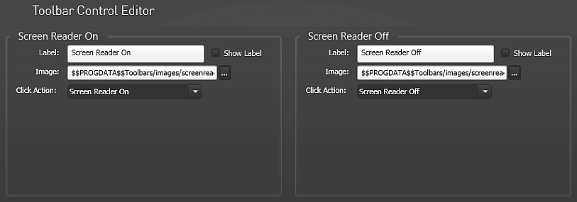
Screen Reader Off
- Label - The text label for the screen reader indicator when it is in the “off” state.
- Show Label - If checked, the label will show on the toolbar, below the button.
- Image - The URL or file path for an image. This image will show as the background for the button when the screen reader indicator is in the “off” state. You can use the default image that is available, or select the ellipsis button to change the image.
- Click Action - For a screen reader indicator, this should be set to “Screen Reader On”.
Screen Reader On
- Label - The text label for the screen reader indicator when it is in the “on” state.
- Show Label - If checked, the label will show on the toolbar, below the button.
- Image - The URL or file path for an image. This image will show as the background for the button when the screen reader indicator is in the “on” state. You can use the default image that is available, or select the ellipsis button to change the image.
- Click Action - For a screen reader indicator, this should be set to “Screen Reader Off”.
For details on adding control styles to your custom screen reader indicators, see Adding Control Styles below.
Customizing Scroll Lock State
This screen is shown when you select the pencil icon for a scroll lock multistate indicator listed in the Toolbar Controls pane.

Scroll Lock Off
- Label - The text label for the scroll lock indicator when it is in the “off” state.
- Show Label - If checked, the label will show on the toolbar, below the button.
- Image - The URL or file path for an image. This image will show as the background for the button when the scroll lock indicator is in the “off” state. You can use the default image that is available, or select the ellipsis button to change the image.
- Click Action - For a scroll lock indicator, this should be set to “Scroll Lock On”.
Scroll Lock On
- Label - The text label for the scroll lock indicator when it is in the “on” state.
- Show Label - If checked, the label will show on the toolbar, below the button.
- Image - The URL or file path for an image. This image will show as the background for the button when the scroll lock indicator is in the “on” state. You can use the default image that is available, or select the ellipsis button to change the image.
- Click Action - For a scroll lock indicator, this should be set to “Scroll Lock Off”.
For details on adding control styles to your custom scroll lock indicators, see Adding Control Styles below.
Customizing Other Multistate Indicators
This screen is shown when you select the pencil icon for a multistate indicator listed in the Toolbar Controls pane (except a caps lock, connection type, num lock, and scroll lock control) listed in the Toolbar Controls pane. (Shown below is the screen for the “Refresh/Stop” button.)

Not Loading State
- Label - The text label for the multistate indicator when no pages are loading in the docked browser window.
- Show Label - If checked, the label will show on the toolbar, below the button.
- Image - The URL or file path for an image. This image will show as the background for the button when no pages are loading in the docked browser window. You can use the default image that is available, or select the ellipsis button to change the image.
- Click Action - For a multistate indicator (other than a caps lock, num lock, or scroll lock control), this should be set to either “Refresh” or “Stop” (for Refresh/Stop control) or “None” (for Busy Indicator control).
Loading State
- Label - The text label for the multistate indicator when pages are loading in the docked browser window.
- Show Label - If checked, the label will show on the toolbar, below the button.
- Image - The URL or file path for an image. This image will show as the background for the button when pages are loading in the docked browser window. You can use the default image that is available, or select the ellipsis button to change the image.
- Click Action - For a multistate indicator (other than a caps lock, num lock, or scroll lock control), this should be set to either “Refresh” or “Stop” (for Refresh/Stop control) or “None” (for Busy Indicator control).
For details on adding control styles to your custom multistate indicators, see Adding Control Styles below.
Adding Pictures
This screen is shown when you select the pencil icon for a picture listed in the Toolbar Controls pane. Enter the URL or file path to your picture (or use the ellipsis button to select it), and it will show on your toolbar when you run the KioWare browser. The file types that can be used are .jpg, .jpeg, .png, .bmp, and .gif. Note: When using the ellipsis button to select a picture, the file path that shows will include substitution variables (for more details on substitution variables, see Configuration Tool, Substitution Variables).

For details on adding control styles to your pictures, see Adding Control Styles below.
Customizing System Clock
This screen is shown when you select the pencil icon for a system clock listed in the Toolbar Controls pane. Set how you want the date and/or time to display and choose the culture, and the custom clock will show on your toolbar when you run the KioWare browser.

- Items to Display - Sets the time/date items you want to show.
- Time - Sets how the time will be shown.
- Seconds - If checked, seconds will show along with the hours and minutes.
- 24 Hour - If checked, a 24-hour clock will show. If unchecked, a 12-hour clock will show.
- Date - Sets how the date will be shown.
- Compact - Shows abbreviated month names (e.g., Sep. 20 2017).
- Reversed - Flips the order of the day and month (e.g., 20 September 2017 or 20/9/2017).
- Month Name - Spells out the month name instead of showing a number.
- Time and Date - Allows any of the above date and time settings to be turned on or off.
- Show Culture - Sets the culture (based on geographical location and language) for the clock.
- Use System Default - If checked, the system default culture will be used.
- Use Custom Culture - If checked, you can select a new culture from the dropdown box to the right. If no specific culture is set, then by default the system culture will be used.
For details on adding control styles to your pictures, see Adding Control Styles below.
Adding Custom Text
This screen is shown when you select the pencil icon for a text item listed in the Toolbar Controls pane. Enter your custom text in the “Text” box, and it will show on your toolbar when you run the KioWare browser.

For details on adding control styles to your custom text, see Adding Control Styles below.
Adding Session Timer Control
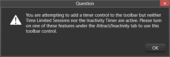
Before you can add a session timer control (in the Toolbar Controls pane of the Docked Toolbar Editor), either the “Turn on time limited sessions” (see Attract/Inactivity Tab, Time Limited Sessions) or the “Use Inactivity Timer” setting (see Attract/Inactivity Tab, Inactivity, Using Inactivity Timer) MUST first be enabled. Attempting to add the control when neither of these settings is enabled will show this warning.
This screen shows when you select the pencil icon for a session timer item listed in the Toolbar Controls pane (when both the “Turn on time limited sessions” and “Use Inactivity Timer” settings are disabled; see above).
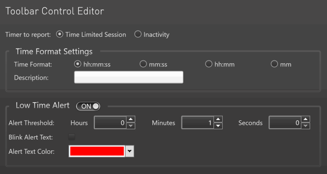
- Timer to Report - Select the mode for the timer. This will tell KioWare to show either the timer for time limited sessions (see Attract/Inactivity Tab, Time Limited Sessions) or the inactivity timer (see Attract/Inactivity Tab, Inactivity, Using Inactivity Timer).
- Time Format Settings - Use these settings to tell KioWare how you want the time to display (format and descriptive label) as it counts down in a timed user session.
- Time Format - Select a format for displaying the time in hours, minutes, and seconds (“hh:mm:ss”, “mm:ss”, “hh:mm”, or “mm”).
- Description - Enter a descriptive label that appears to the left of the time (e.g., “Session Time Remaining”).
- Low Time Alert - When the slider is set to “ON”, use these settings to show colors and blinking when there is little time remaining in a timed user session.
- Alert Threshold - When the time countdown has this amount of time remaining (in hours/minutes/seconds), then the description and time will change color and blink based on the settings below.
- Blink Alert Text - If checked, the description and time will begin blinking when the “Alert Threshold” (see above) is reached.
- Alert Text Color - Select the color that the description and time will change to when the “Alert Threshold” (see above) is reached.
For details on adding control styles to your session timer control, see Adding Control Styles below.
Adding Control Styles
Note: Adding control styles is for advanced users only. This pane is shown when you select the pencil icon for any control listed in the Toolbar Controls pane. Setting up styles for your toolbar controls is just like setting up styles for your toolbar body, only the settings are for the individual buttons, boxes, images, etc., that are on your toolbar. See Setting Up Multiple Toolbars, Toolbar Body Styles above for details on these settings.
Context Menu Settings
This window shows when you select the “Context Menu Settings” button on the User Interface tab.
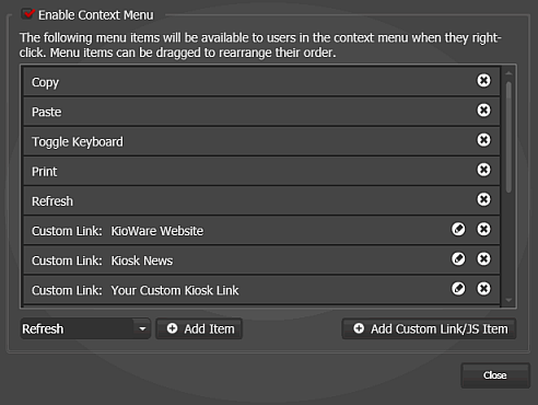
- Enable Context Menu - Check this box to enable context menus when right clicking in the KioWare browser. The settings below will become available.
- Note: When checking the “Enable Context Menu” checkbox, the “Mouse Click Options” setting (see User Interface Configuration Options, Mouse Click Options above) must also be set to “None Blocked” in order for context menus to show when right clicking in the KioWare browser. If this setting is already set to “Block Right Click Only” and you try to check the “Enable Context Menu” checkbox, you will see this warning. Select “Yes” to enable the context menu and automatically reset the “Mouse Click Options” setting to “None Blocked”.
- Add Item - Select an item from the dropdown menu to the left, and then select this button to add a new item to the context menu. The item will show in the pane above.
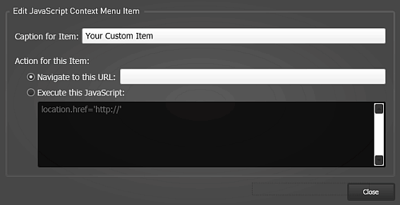
- Add Custom Link/JS Item - Select this button to add a custom URL or JavaScript item to the context menu. A popup window shows these settings (see image below).
- Caption for Item - Enter a caption (label) for the custom link or JavaScript item. This will show as an option in the context menu.
- Action for this Item - Tells KioWare what to do when this item is selected on the context menu.
- Navigate to this URL - If selecting this option, you can create a context menu option that takes users to the URL entered at the right.
- Execute this JavaScript - If selecting this option, you can create a context menu option that runs the JavaScript entered below.
- Edit (pencil icon) - (Only available for custom link/JavaScript items) Select this icon (see image above) to change an item in the context menu. The above settings show.
- Delete (“X” icon) - Select this icon (see image above) to remove an item from the context menu.
Example Context Menu
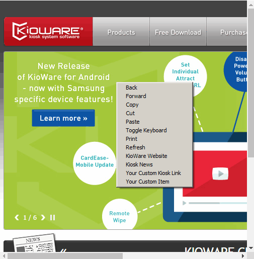
After setting up a context menu in the Config Tool and then running the KioWare browser, you can right click anywhere in the browser window and show your custom menu (see image below).
Related Terms and Questions
If the answers to your questions are not in this table, visit the KioWare website for frequently asked questions (FAQs).
| What is the taskbar? | It is the bar in MS Windows that contains shortcuts for opening applications and can also be used to monitor applications that are running. Though generally showing at the bottom of your screen in MS Windows, the taskbar can appear at the top, left, or right. The “Show Taskbar” and “Taskbar Height” settings are used to tell KioWare to either hide the taskbar when the KioWare browser is running or to show it at a specific size. |
| How do I switch between open programs on the taskbar when KioWare is running? | Note: This is generally not recommended because access to the taskbar may allow open programs to be closed or unwanted programs to be opened, which will make your kiosk much more easily hacked into. Here are the steps for doing this, but remember that you will be doing it at your own risk. On the Keyboard Filtering Tab (see Keyboard Filtering Tab), be sure that the “Alt+Tab” setting shows a green checkmark (tells KioWare to allow Alt tabbing). If it shows a red “X” (tells KioWare to block Alt tabbing), select it to change to a green checkmark. Then, when KioWare is running, users can hold down the Alt key and press the Tab key to move between all open programs that would show on the taskbar. |
| What is a context menu? | It is a popup menu that shows when pressing the right button on your mouse (if using a mouse with two buttons) or holding down the Control (ctrl) key and pressing the left mouse button (if using a mouse with only one button). A context menu shows where your mouse cursor or mouse pointer is on the screen. It contains a limited number of menu options and often includes different ways to use options that are already in the toolbars of a system or software. When text, images, and other objects are selected, the context menu only shows options that relate to the selected object(s). When displayed on a screen, desktop, or webpage, the menu shows choices that pertain to the current state (context) of the operating system or software application. In KioWare, you can create a custom context menu for the KioWare browser. Select the “Context Menu Settings” button on this tab. Then choose an item from the bottom left dropdown of the window that appears, and select the “Add Item” button. Use the “Add Custom Link/JS Item” button to add a custom URL or JavaScript item to your context menu. (See Scripting for more details on using JavaScript in KioWare.) |
| What is a virtual keyboard? | It is an on-screen keyboard that you can use to enter numbers or text into textboxes. If the virtual keyboard is enabled and the “Auto-Show Virtual Keyboard” box is checked, the keyboard appears when you place your mouse cursor in (or touch, if using a touchscreen) a textbox. Use the “Keyboard Height” and “Keyboard Width” boxes to set the size of your virtual keyboard. When selecting “Use HTML Keyboard”, the HTML Keyboard Settings show for using a custom keyboard and setting the colors and zoom percentage. |
| What is the difference between the default and material HTML keyboards? | The default keyboard is the keyboard that is built-into KioWare. The material keyboard is the standard keyboard that is built into all devices running the Android operating system, and it is set up according to the Android guidelines. This keyboard does not show borders around the individual keys. Use the “Keyboard Path/URL” dropdown to tell KioWare which type of keyboard you want to show in the KioWare browser. After selecting the keyboard type, you can also enter a file path or URL for a custom keyboard (see below), as long as the keyboard is the same type that you selected. |
| What is Hot Virtual Keyboard | It is a virtual keyboard available from Comfort Software Group that is designed to help users increase productivity and find more enjoyment while using their computers or kiosks. Supporting multiple languages, Hot Virtual Keyboard can be customized to the look that suits your needs (background, shape, color and font of the keys, sounds of different key groups, etc.). Its features include programmable keys/shortcuts (e.g., paste customized text, launch application, open web page, or run macro with a single tap), Microsoft Word auto-complete, and gestures to quickly change case or insert spaces. Keys on the keyboard can be assigned different actions to control Microsoft Windows behavior (e.g., connect/disconnect from a network, volume up/down, mute, eject/close CD, monitor on/off, start screen saver), and this keyboard can be integrated into other systems. To tell KioWare to use Hot Virtual Keyboard instead of its built-in HTML keyboard, select “Use Hot Virtual Keyboard” in the virtual keyboard dropdown and set the keyboard width and height (in pixels or percentages). If you want the keyboard to show whenever a textbox is clicked in (or touched, if using a touch screen), check the “Auto-Show Virtual Keyboard” box. |
| How do I create a custom HTML keyboard? | You will want to make a copy of the built-in KioWare keyboard, which is located in C:\ProgramData\KioWare Client\Keyboards. Depending on whether you want to use the default or material keyboard (see above), copy the default.keyboard.html file or the material.keyboard.html file and rename it. Then customize this file to suit your needs, and enter the file path in the “Keyboard Path/URL” box. (Note: You will want to save your custom keyboard to your user data directory, so that upgrading or re-installing KioWare does not overwrite it. See Configuration Tool, Related Terms and Questions for more information on your user data directory.) Next, you can use the HTML Keyboard Settings to customize the color of text, background, any theme you use, spacebar, and zoom percentage. For help with custom keyboards, contact KioWare via phone (Toll Free USA: 877-843-4790; International: 1-717-843-4790) or our website (www.kioware.com). |
| Can I use the Windows virtual keyboard with KioWare? | Though KioWare does not support use of the Windows virtual keyboard, it does have a built-in HTML keyboard that you can use. Set the virtual keyboard slider to “Use HTML Keyboard”, and the HTML Keyboard Settings show for using a custom keyboard (see above) and setting the colors and zoom percentage. |
| When I run KioWare, the main window is sized smaller and will not let me maximize it. | If you are using a virtual keyboard and the “Auto-Show Virtual Keyboard” checkbox is checked, your keyboard may show automatically when you start KioWare. The keyboard shows at the bottom of your screen and makes the main KioWare window shrink in size. The larger you make your keyboard, the smaller the main KioWare window will be. Very large keyboards may not show and may shrink the KioWare window to a size that is unusable. For best results, we recommend that you set the “Keyboard Height” to about 250 and set the “Keyboard Width” to about 1000. |
| What is the difference between the KioWare browser window and docked browser windows added on this tab? | The KioWare browser window is your main browser window. It will always show. If you want to add other docked browser windows, they will appear around this main browser window (above or below it, or to the left or right of it, based on how you set them up). You do not need to set up the main browser window, except for setting the home page (see General Tab, Start Page URL). To set up additional docked browser windows, select the “Browser” button and enter the settings on the Docked Browser Editor screen. |
| Why do I always see one more browser window than I have added on this tab? | The extra browser window is the main KioWare browser window (see above), which will always show. |
| How do I open a new tab? | By adding a custom link to a toolbar. Select the “Toolbar” button to add a new toolbar, or select the pencil icon to edit a toolbar. On the Docked Toolbar Editor screen, select “Add Control”, “Action Button”, “Custom Link”. The custom link will appear in either the Top Controls or Bottom Controls panes, depending on where you add it. Select the pencil icon for this custom link. On the Toolbar Control Editor screen, select “Custom Link” in the “Click Action” dropdown and enter the following in the “URL” box:
javascript:window.open('about:blank');
Using the “Label”, “Show Label”, and “Image” settings, you can give this link a custom label and image. You can also use the “Add Styles” button to set up custom styles. Now, when you run the KioWare browser, you can select this button to add new tabs within your docked browser window. Note: You must allow the JavaScript in the Scripting Access List for the link to work properly in the browser window. (See Security Tab, Scripting Access List Configuration Screen for more details on setting up your scripting access list).
|
| How do I run JavaScript from the KioWare browser? | There are two ways to do this.
- You can set up a custom link on your toolbar (e.g., for opening a new tab; see above) and enter JavaScript commands for the URL. This link will run JavaScript within the browser window, which means that the script must be allowed in the Scripting Access List for the link to work properly (see Security Tab, Scripting Access List Configuration Screen).
- You can set up a toolbar JavaScript control on your toolbar. Doing this allows JavaScript to run directly from the toolbar (instead of the browser window), and so you do not need to add the script to the Scripting Access List (see Security Tab, Scripting Access List Configuration Screen). To do this, select the pencil icon for your toolbar (to edit) or select the “Toolbar” button (to add a new toolbar). On the Docked Toolbar Editor screen, select “Add Control”, “Action Button”, “Toolbar JavaScript”. In the pane below, select the pencil icon for your toolbar JavaScript control, and then enter your custom JavaScript in the “JavaScript to Execute” box.
|
| What are spacers? | They are “blocks” that you can add between toolbars and docked browser windows when you design your KioWare window. On the Docked Spacer Editor screen, you can set the sizes and positions of spacers, add custom colors and images to them, and tell KioWare when to show/hide them (e.g., during Attract Screen mode, user session, or both). This screen shows when you add (using the “Spacer” button) or edit (using the pencil icon) a spacer. |
| What is the ZoomText® Magnifier? | It is software available from Ai Squared that includes tools for helping users with special visual needs to operate a kiosk or computer, such as a screen magnifier. It must be installed on the kiosk or computer that is running KioWare, and then must be enabled for use with the KioWare browser (see Assistive Technologies Tab, Screen Magnifier). Buttons for controlling the ZoomText zoom percentage can be added to the KioWare toolbar. Select the pencil icon for a toolbar to show the Docked Toolbar Editor screen. On this screen, select the “Add Control” button, and then select “Action Button” and either “Screen Zoom In” (to increase the zoom percentage) or “Screen Zoom Out” (to decrease the zoom percentage). Select the pencil icon for either of these buttons to customize the text label and image for the button. (For more information on how KioWare can be used with other software and devices designed for users with special mobility and accessibility needs, see Assistive Technologies Tab.) |
| What is JAWS®? | JAWS (Job Access With Speech) is a screen reader available from Freedom Scientific. It includes tools for users with special vision or mobility needs (e.g., braille and speech output), so that they can easily use a kiosk or computer. JAWS must be installed on the kiosk or computer that is running KioWare and must be enabled in order to use it with KioWare (see Assistive Technologies Tab, Screen Reader). Indicator buttons for showing when JAWS is turned on and off can be added to the KioWare toolbar. Select the pencil icon for a toolbar to show the Docked Toolbar Editor screen. On this screen, select the “Add Control” button, and then select “Multistate Indicator” and “Screen Reader”. Select the pencil icon for this button to customize its text label and image for the “on” and “off” states. (For more information on how KioWare can be used with other software and devices designed for users with special mobility and accessibility needs, see Assistive Technologies Tab.) |
| What do I enter into the color settings for toolbar additional controls? | Enter a specific hex color value (e.g., #8B0000) or color name (e.g., red). |
| How do I change the order of browsers, spacers, and toolbars that I have added? | Select any docked browser, spacer, or toolbar in the UI Elements pane and drag it up or down to reorder. Note: These items must be in a certain order to show correctly when you run the KioWare browser (see below). |
| In the KioWare browser, my browser windows, toolbars, and spacers are not arranged like I have set them up. | First, remember that the main KioWare browser window will always show, and any other docked browser windows you add will be positioned around this main browser window (see above). Second, docked browser windows, spacers, and toolbars must be added in a certain order for them to show correctly when running the KioWare browser. In general, if you want spacers at the top lefthand or top righthand corners, you need to dock them at the top (not left or right). Also, add docked browser windows in this order: top windows, bottom windows, center windows. Below are some hints for setting up certain arrangements of these three items. |
Top lefthand spacer, top toolbar, and left toolbar | Set them up in this order:
- Top lefthand corner spacer - set “Docked Mode” to “Docked Top”, “Width” value/unit to 5%, “Height” value/unit to 10%, and “X” settings to automatically fill.
- Top Toolbar - set “Docked Mode” to “Docked Top”, “Width” value/unit to 95%, “Height” value/unit to 10%, and “X” settings to automatically fill.
- Left Toolbar - set “Docked Mode” to “Docked Left”, “Width” value/unit to 5%, “Height” to automatically fill, and “Y” settings to automatically fill.
This will show a top lefthand corner spacer that is 5% of the screen width, adjacent to a top toolbar that is 95% of the screen width, and a lefthand toolbar below the spacer.
|
Top toolbar, top right spacer, and right toolbar | Set them up in this order:
- Top toolbar - set “Docked Mode” to “Docked Top”, “Width” value/unit to 95%, “Height” value/unit to 10%, and “X” settings to automatically fill.
- Top righthand corner spacer - set “Docked Mode” to “Docked Top”, “Width” value/unit to 5%, “Height” value/unit to 10%, and “X” settings to automatically fill.
- Right toolbar - set “Docked Mode” to “Docked Right”, “Width” value/unit to 5%, “Height” to automatically fill, and “Y” settings to automatically fill.
This will show a top toolbar that is 95% of the screen width, adjacent to a top righthand corner spacer that is 5% of the screen width, and a righthand toolbar below the spacer.
|
Top and bottom browser windows | Remember that the KioWare main browser window will be your center window, so you will actually show three browser windows. Set them up in this order:
- Top browser - set “Docked Mode” to “Docked Top”, “Width” to automatically fill, and “Height” value/unit to 33.33%.
- Bottom browser - set “Docked Mode” to “Docked Bottom”, “Width” to automatically fill, and “Height” value/unit to 33.33%.
This will show three browser windows in a row up and down the screen, all of the same height. If you want to add top or left toolbars, they must be added before any browser windows. You will have to shrink the size of your docked browser windows to account for the size of the toolbars.
|
Left and right browser windows | Remember that the KioWare main browser window will be your center window, so you will actually show three browser windows. Set them up in this order:
- Left browser - set “Docked Mode” to “Docked Left”, “Width” value/unit to 33.33%, and “Height” to automatically fill.
- Right browser - set “Docked Mode” to “Docked Right”, “Width” value/unit to 33.33%, and “Height” to automatically fill.
This will show three browser windows in a row across the screen, all of the same width. If you want to add top or left toolbars, they must be added before any docked browser windows. You will have to shrink the size of your docked browser windows to account for the size of the toolbars.
|
Top/bottom and left/right browser windows | Remember that the KioWare main browser window will be your center window, so you will actually show five browser windows. Set them up in this order:
- Top browser - set “Docked Mode” to “Docked Top”, “Width” to automatically fill, and “Height” value/unit to 33.33%.
- Bottom browser - set “Docked Mode” to “Docked Bottom”, “Width” to automatically fill, and “Height” value/unit to 33.33%.
- Left browser - set “Docked Mode” to “Docked Left”, “Width” value/unit to 33.33%, and “Height” to automatically fill.
- Right browser - set “Docked Mode” to “Docked Right”, “Width” value/unit to 33.33%, and “Height” to automatically fill.
This will show one top browser window that is the entire width of the screen, three center browser windows of the same width, and one bottom browser window that is the entire width of the screen. If you want to add top or left toolbars, they must be added before any docked browser windows. You will have to shrink the size of your docked browser windows to account for the size of the toolbars.
|
Nine browser windows in three rows of three | Remember that the KioWare main browser window will be your center window, so you will need only eight additional browser windows. Set them up in this order:
- Top left browser - set “Docked Mode” to “Docked Top”.
- Top center browser - set “Docked Mode” to “Docked Top”.
- Top right browser - set “Docked Mode” to “Docked Top”.
- Bottom left browser - set “Docked Mode” to “Docked Bottom”.
- Bottom center browser - set “Docked Mode” to “Docked Bottom”.
- Bottom right browser - set “Docked Mode” to “Docked Bottom”.
- Center left browser - set “Docked Mode” to “Docked Left”.
- Center right browser - set “Docked Mode” to “Docked Right”.
If you want all browser windows to be the same size, set the “Unit” for both height and width to percentage, and set all height and width values to 33.33. If you want to add top or left toolbars, they must be added before any docked browser windows. You will have to shrink the size of your docked browser windows to account for the size of the toolbars.
|